As savage Arctic cold was getting ready to surge south across North America, vivid imagery based on data from weather models showed us what was going to happen. Now, views from space are showing us what actually happened — and the imagery is no less compelling.
As predicted by the models, the jet stream took a giant southward dip on Dec. 21, opening the door to the Arctic and allowing savagely cold air to surge all the way down to the Gulf of Mexico. As this unfolded, a potent storm system exploded, tapping into energy in the jet stream and the stark contrast between temperatures on either either side of the cold front. Worst hit was the Buffalo, N.Y. region, which was buried in places by 50 inches of snow and where, sadly, at least 28 people have lost their lives.
Distortion of the stratospheric polar vortex heralded the coming meteorological bedlam, raising the odds that the jet stream, lower down in the atmosphere, would take that giant southward dip.
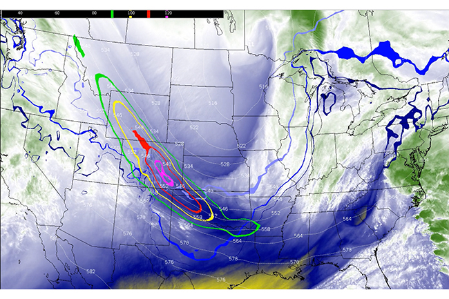
This infrared view of the action captured by the GOES-16 satellite on Dec. 21 and 22 shows the movement of water vapor in the atmosphere, helping reveal the jet stream’s dynamics as the Arctic outbreak unfolded. (The animation is courtesy of the Satellite Liaison Blog, where you can find more views of this extreme weather event.)
Pocket of Potent Energy
The westerly jet stream winds that circle the Northern Hemisphere naturally develop big north and south dips like this, called “longwaves.” Embedded in the longwave seen here is a pocket of potent energy called a “shortwave” that’s moving fast within the jet stream’s flow. In the animation, it first appears at the upper left, with colored contours denoting wind speeds. At the heart of this feature, within the pink contours, winds exceeded 120 knots (138 mph).
Shortwaves embedded within longwaves like this are the main instigators of episodes of precipitation — in this case, the potent, and ultimately deadly, snowstorm. (For more about longwaves and shortwaves, check this out: https://www.weather.gov/jetstream/longshort)
The squiggly blue lines laid over the water vapor imagery are contours showing temperatures at the surface. Temperatures decrease from the darkest blue, at about 32 degrees F, to the lightest blue at about 0 degrees F. In particular, keep your eyes on the darkest blue contour, with its freezing temperatures. As the Arctic outbreak unfolds, it dips all the way to southern Texas and Mexico!
You can see evidence of that savage southward surge of Arctic conditions in this animation from the GOES-18 satellite (situated in geostationary orbit a bit west of GOES-16). The animation starts at night. As the cold front advances from the north, evidence of its expansion is visible in the form of clouds, which appear blue in the animation.
These clouds are the result of the interaction between the frigid air and warmer conditions ahead of it. As a cold front like this advances, the cold air, being denser, pushes under warmer air ahead of the front. This pushes the warmer air up, causing tiny water droplets to condense and form clouds.
In the animation, as night turns to day the view switches and we see the clouds in a more natural white color. The cold front is very starkly delineated as it sweeps south across Texas all to the Gulf of Mexico.
Looking ahead, there are signs that the stratospheric polar vortex could again become stretched, which would tip the odds in favor of colder than normal conditions east of the Rockies after mid-January, according to atmospheric scientist Judah Cohen.


